
This is my first blog post for the course “Discourses of Advertising”. The assignment specs: “Pick a genre of advertising from the list…and create an informal (though still insightful) commentary on the tropes and conventions of that particular genre. … Some questions you might address: what features of this particular genre are entrenched? What is the value of the patterns that you identify to the particular product in question? How do these patterns reflect things like audience, client, cultural context (geographic, cultural, ideological, etc)? Overall, how do the design features of this genre speak to our society as a whole?” (Wordcount is 1100 without subtitles, endnotes, sources cited, and this paragraph.)
The stereotypical can-of-coffee ad: Blatant product shots
In this Folgers ad[1] and this final shot of a Maxwell House video ad,[2] there is no attempt at subtlety. (I was unable to view the full video, so I will treat the final shot as a print ad for the purposes of this post.) To use Barry’s terms, these renderings are more “literal” than “lateral”. Branding is at the forefront: In both cases, the ad is formed around a picture of the product plastered with the client logo. Fonts and backgrounds reinforce branding within the ads, as well as across contemporary and historical campaigns (a red can and cup match Folgers’ red logo, along with a background that is an ostensibly photographic representation of the mountains in the logo; white text and a blue background mirror Maxwell House’s logo). Calling these rhetorical artefacts “adsy”, to quote Barry, is putting it mildly.
Trope: Home on the range
The emphasis on product and branding makes these ads similar to this 1954 Folgers ad[3] and this 1921 Maxwell House ad[4] (no product shot for this one, but this is made up for by a logo that occupies a third of the visual space). The modern ads remove human subjects from the frame, implying human presence through the human-processed coffee and human-purposed cups; arguably, the modern ads emphasize the individual, rather than society. The Folgers ad, for example, presents the coffee can and cup against a backdrop of jagged mountains, appealing to the North American “myth” (in Barthes’ sense) of the isolated pioneer. (Here, we could segue to Barry’s concept of “exaggeration” (38).) The Maxwell House ad decontextualizes the product further, presenting the coffee can and cup against a plain background; the focus here is almost solely on branding. By contrast, the vintage ads focus on human presence and interrelation, with fictional consumers endorsing the products. The vintage ads, thus, focus on logos (our product is good according to these fictional consumers), as well as ethos (the fictional consumers are middle-class white men – the “unmarked” demographic, to refer to Greimas’ semiotic square). The modern ads focus primarily on ethos, both through long-established brand identity, and in Folgers’ case, an American origin “myth”. The all-American feel is reinforced by the use of “wakin’” in the tagline (this links to Solomon’s discussion of belonging and patriotism (3-4)).
Of course, an appeal to patriotism problematizes my argument that this ad emphasizes the individual; however, I think it’s possible for a rhetorical artefact to appeal to multiple, contradictory “myths” or tropes, and for this to be why it’s effective until critiqued. With this in mind, the Folgers ad places the viewer in the position of the isolated pioneer/cowboy/voyageur – or holiday-maker. In this, individuality and isolation are emphasized. The ad also, through this myth of the individual, leads us to the “Land of the Free”, a collection of (sometimes) like-minded individuals, if you will.
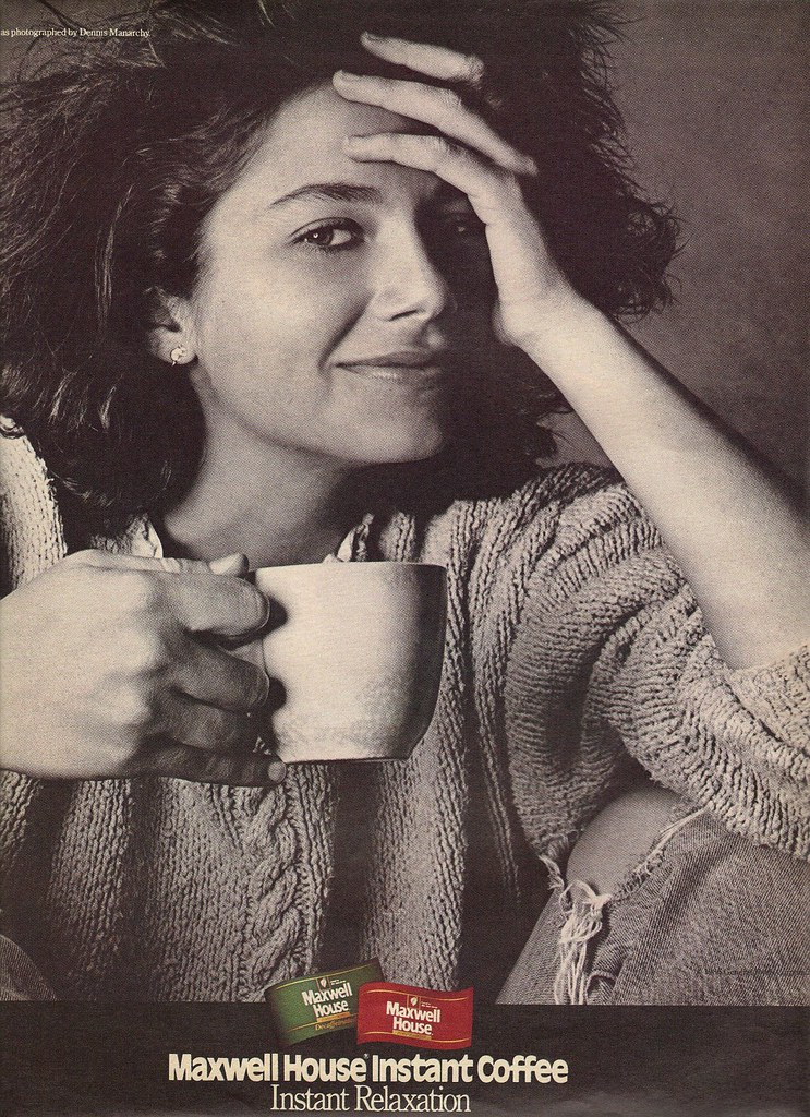
Trope: Coffee as comfort
Cristi Jayo’s 2010s rebranding of Folgers[5] resembles this 1986 ad for Maxwell House.[6] A sense of tranquility is created by using greyscale in the Maxwell House ad and a desaturated palette in Jayo’s rebranding; soft focus contributes to this feeling of calm and comfort, especially in Jayo’s piece. Chunky knit fabrics and casual postures again reinforce the trope. As the Maxwell House tagline claims, instant coffee is “instant relaxation”.
Both ads feature a dark, young woman. Leaving aside questions of beauty norms, this choice of subject/model works on several symbolic levels. Most obviously, it appeals to a young, hip(ster) demographic. Having a young woman as the subject also appeals to tropes of “femininity as purity” and the “domestic angel”, creator of comfort – harkening back to vintage coffee ads like this one by Maxwell House in 1934,[7] and this one by Chase and Sanborn in the 1950s.[8] Jayo’s rebranding bypasses this to some degree by only showing the model’s lower limbs, de-emphasizing gender, but (within a feminist critique) also objectifying the model by “dissecting” her, reducing her to component body parts rather than portraying her as a whole person. (Based on North American gender norms, one would likely assume the model to be a woman, due to her shaven legs and small hands and feet – but this obviously (a) reduces gender to a cis-centric binary and (b) assumes that you can “know” someone else’s gender identity from looking at them.) However, based on socio-cultural “signs” (to use the term from semiotic theory) like clothing, I also feel that these ads appeal to a different, albeit still normative, rendering of femininity – the young woman as a brilliant student, hardworking professional, savvy saver, and enthusiastic traveller – in short, the “hipster” girl.
Then there’s the colour association between the model and the product. Rather than an obvious costuming choice to unite model and brand (red shirt for Folgers, blue shirt for Maxwell House), the models are subtly linked to the coffee through their dark skin and hair. This again is problematic, in this case from the standpoint of postcolonialism. Do these ads break down the racism and sexism entrenched in 19th and early 20th century coffee ads, by featuring a dark complexioned woman whose ethnicity isn’t immediately apparent? (Here’s another excruciating example from Maxwell House.)[9] Or do they perpetuate prejudice, masking it as neutrality?
The lie of realism: Ceci n’est pas une publicité.
The greyscale or desaturated palettes fit neatly with Solomon’s concept of “new realism” (9). The ads are crafted to feel like snapshots of life, with the viewer plopped in the middle of the narrative. In the Maxwell House ad, you share a cup of coffee with a fictional character, perhaps a close friend; in Jayo’s rebranding, you see the world through the fictional subject’s eyes. To further this sense of realism, the product is shown only as a cup of coffee, not a heavily branded can. The claim to realism is stronger in Jayo’s work, with the barely-there, sans serif, text-only logo; claims to realism in the Maxwell House ad are immediately belied by the unnaturally straight border, the high-“chrome” (visually elaborate) logo within it, and the blank background.
To sum up: In many ways, these ads differ from the can-of-coffee ads discussed above. They appeal to realism rather than in-your-face-branding, and a trope of comfort rather than nationalism. But in other ways, the ads discussed in this post share major tropes and advertising “tools” (Barry 18). Most notably: Use of colour reinforces branding (the brand for its own sake, i.e. Folgers = red; or the “feel” of the brand, i.e. Maxwell House = comfort); and the product is featured in the image (either “literally”, as a can of coffee with the brand name on it, or “laterally”, as a cup of coffee with a discreet logo at the bottom of the ad).
Endnotes
[1] All rights owned by Folgers; image accessed via http://hrsbstaff.ednet.ns.ca/lstewart3/ENG%2010/advertising_strategies_scavenger.htm .
[2] All rights owned by Maxwell House; image accessed via http://www.coloribus.com/adsarchive/tv-commercials/maxwell-house-invitation-11564205/ .
[3] All rights owned by Folgers; image accessed via https://www.flickr.com/photos/alsis35/6783305364/ .
[4] All rights owned by Maxwell House, image accessed via http://en.wikipedia.org/wiki/Maxwell_House .
[5] Images and concepts owned by Cristi Jayo; “Folgers” name owned by Folgers; image accessed via http://galleryhip.com/folgers-coffee-advertisement.html .
[6] All rights owned by Maxwell House; image accessed via https://www.flickr.com/photos/slantedenchanted/6265187159/ .
[7] All rights owned by Maxwell House; image accessed via http://www.minerd.com/annetteartifacts.htm .
[8] All rights owned by Chase and Sanborn; image accessed via http://www.cracked.com/article_15852_5-retro-commercials-companies-would-like-you-to-forget.html .
[9]All rights owned by Maxwell House; image accessed via http://neatdesigns.net/22-shockingly-racist-ads/.
Academic sources
Barry, P. The Advertising Concept Book. New York: Thames and Hudson 2012. 8 – 42.
Solomon, J. The Signs of Our Time. Toronto: HarperCollins 1990. 59 – 76. Accessed via: http://www.indiana.edu/~slavicgf/e103/assignments/solomon_reading_1.html, 11 January 2015.

![Folgers ad[1]](http://popsop.com/wp-content/uploads/folgers_best_part_of_waking_up_tm.jpg)
![Maxwell House video ad,[2]](http://files2.coloribus.com/files/adsarchive/part_1156/11564205/oreo-invitation-600-96262.jpg)