
Critique of Piggy Paint’s Current Homepage
There are things I like about the current Piggy Paint homepage and things I would like to change. I’ve organized my critique by the structure of the prof’s specs for the assignment: navigation, content, social media, legal, and branding.
Navigation: The traditional top bar works fine, but gets lost in the visual noise of the homepage.
Content: Again, the content is good, but get lost in the visual noise. There’s too much content crowded into the top half of the homepage, which makes it difficult to quickly pinpoint the information you want.
Social Media: I like the small ribbon with buttons for each social media platform. The ribbon frames the buttons, separating them from other content. However, the sidebar again gets lost in the visual noise – in particular, proximity isn’t used effectively in the sidebar. The sidebar needs more padding between elements so you can different the elements.
Legal: Again, this section is crowded and therefore difficult to navigate.
Branding: The branding is good – consistent use of logo and colours.
Conclusions: Strengths of the current design include effective use of colours and fonts to create strong branding, good use of alignment and coloured backgrounds as framing tools, and a relaxed, creative style that can appeal to both parents and children (for example, simple language and a title font that resembles children’s writing).
The major weaknesses are about use of space:
a) ineffective use of framing tools to establish clear associations between connected elements/content and distance between less strongly connected elements/content in:
– the sidebar
- major problem is ineffective use of proximity
- elements aren’t spaced far enough apart and therefore aren’t differentiated;
– the top bar (above the navigation bar)
- major problem is ineffective use of backgrounds/borders to establish associations and distance between elements
- this again results in elements not being effectively differentiated;
– the legal section
- major problem is alignment
- if the copy were aligned left or justified, it would be easy to read through the brief legal statements. Instead, the copy has been set up similarly to a set of hyperlinks, aligned to the centre with a vertical bar between each sentence. This makes it difficult a) to immediately identify the content as copy rather than hyperlinks (false affordance), b) to identify each part of the copy as being connected to the others (unnecessary differentiation with the vertical bars), and c) to read the copy.
b) a poorly balanced layout overall (the homepage is top-heavy, with a massive amount of wasted space at the bottom of the page).

My concept map. All rights reserved by Popinjay Design.

*Image courtesy of Piggy Paint Natural as Mud LLC and August Afternoon Design.

*Image courtesy of Piggy Paint Natural as Mud LLC and August Afternoon Design.

*Image courtesy of Piggy Paint Natural as Mud LLC and August Afternoon Design.
——————————————
Solutions
Balance: To improve the balance of the homepage, I have removed the side bar. There wasn’t much in it, and what was there wasn’t strongly connected – so there wasn’t much logical justification for having the sidebar in the first place. I have also grouped together strongly associated elements, giving each of the major sections a theme (shopping in the top bar, social media and other contact information along the left, highlights about products in the centre, and special offers on the right). This eliminates some of the visual noise of the current homepage, which has various elements strewn about higgledy-piggledy – pardon the pun! (for example, the disconnected yet undifferentiated elements in the sidebar).

All rights reserved by Popinjay Design.
Proximity: With the sidebar removed, there aren’t so many proximity issues with the current design. In my own design, I have used a consistent amount of padding throughout the homepage – 50 pixels between what I think of as “major” sections (i.e. “Welcome”/contact info, “Products”, and “Deals”) and 25 pixels between “minor” sections (the more closely connected elements within each “major” section).

All rights reserved by Popinjay Design.
Other framing tools: My mockup uses lots of borders; I’m planning to replace many of them with coloured backgrounds like those in the main section of the original homepage (the images and coupon). I like the use of coloured backgrounds/boxes in the current design, but I think it should be used more consistently throughout the design (to connect, for example, the shopping hyperlinks (in the top right corner of my design) and differentiate them from other elements in the top bar).

All rights reserved by Popinjay Design.
——————————————
Technical Challenges
I encountered several situations in Photoshop that required some creative thinking, particularly when I was trying to adjust assets taken from the current Piggy Paint homepage. This would be less of an issue if I were working with the original files rather than screenshots – using screenshots meant that I was sometimes working with very small, rasterized objects that were difficult to edit. These are some of the solutions I came up with for the assignment:
“Celebrity Sightings” Button
I wanted to keep this button in the mockup because I feel that likely the owners of this small business would want to keep this good publicity visible on their website. However, the current design of the button a) made it difficult to maintain the proportions of my layout, and b) became a challenge when I wanted to edit the colours (because I was working with a flattened object rather than a series of editable layers). I tried working through various options: clipping out the stars using a layer mask made it possible to fit the text in the area I had designated for the button. However, it was extremely difficult to edit out the background from the small, intricate text, even using the smart selection and magnetic lasso tools, which had disappointing results when I tried to place only the text ontop of the coloured background layer I had created. (I wanted to keep the dark pink background in the new button to create a consistent look to my buttons, and also to make them salient – things you want people to click on should stand out from the rest of the page.) In the end, I comprimised by creating a new button using the copy from the current website, and approximating the font in Piggy Paint’s logo using “Chalkduster”. For the purposes of this first-semester assignment, I unfortunately wasn’t able to track down the original font, although if I were in working with the business owners I would hopefully have access to their original assets (including font).

Trying to remove the white background from a screen capture of the Celebrity Sightings button. Because the text was so tiny and so irregular in shape, it was practically impossible to remove all the white pixels, even when I zoomed in and worked with a one pixel brush.

I got much more satisfying results by recreating the button, eliminating the need to remove the background from the text. Although I regrettably couldn’t find the name of the original font, and therefore couldn’t search for and use it, I mimicked the original font with “Chalkduster”. I also applied a layer mask to the stars in the original button and used them in my new button. I would prefer to use the logo instead of the stars, but the significant problems removing the background prevented this.
Nailpolish Swatches
An element of the current website that I love and wanted to use more extensively in my mockup was the nailpolish swatch at the top of the homepage, which acts a background for the text “Say goodbye to harsh, smelly chemicals!”. I was able to successfully work with this element in my earlier versions of the mockup, and was very happy with the buttons and backgrounds I created with this element. However, after creating the coloured backgrounds for my sections of content, I realized that the swatches were the same colour as the pale pink backgrounds. I decided to recolour the swatches in the same dark pink as the oblong buttons, both to differentiate them from the pale pink backgrounds, and to make them more salient (since, again, they needed to be highly visible, like the oblong buttons). Once again, I initially encountered disappointing results, this time from the colour replacement tool. Presumably because the original swatches were so pale, there was no change in colour when I used the dark pink, and even when I experimented using dark brown, what showed up was a pale sand colour. In the end I had to create my own assets. Even with the new, darker paint swatch I found, the colour replacement tool did a poor job, so I improvised by creating a dark pink background, selecting the shape of the paint swatch, and creating a layer mask on the pink background layer. This finally gave me the results I needed.
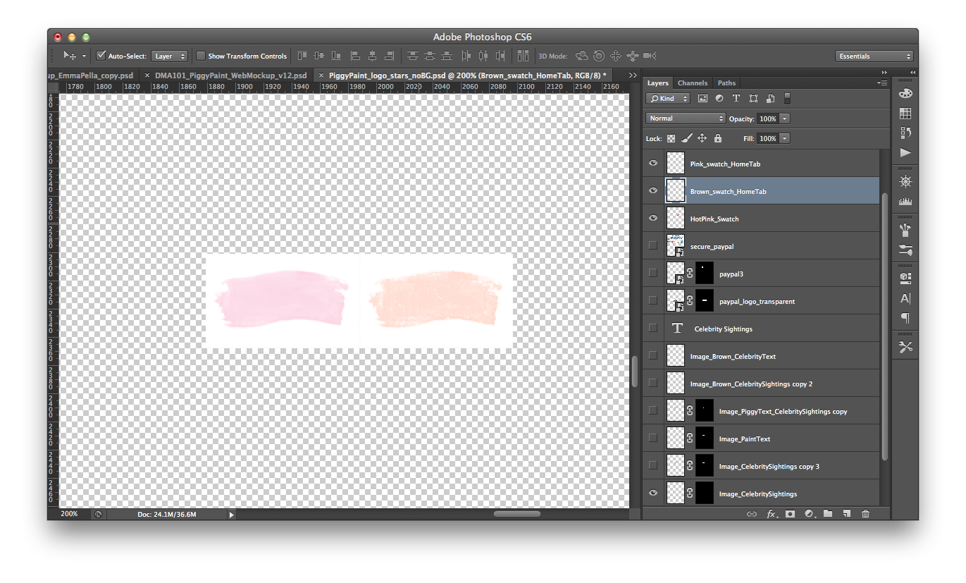
The original pale pink swatch is on the left. The recoloured swatch is on the right – although I used a dark brown, the result was a pale sand colour. *Image courtesy of Piggy Paint Natural as Mud LLC and August Afternoon design.

The elements I used to create my dark pink swatch.

My finished swatch with the layer mask visible in the layers window on the right.
“Featured Product” Image
A challenge that created fewer headaches for me was adding a Halloween themed background to the image I chose for the “Featured Products” section. I used the magnetic lasso tool to select the image, chose “select inverse”, and applied a fill.

The “Featured Product” image I created using a photo from the Piggy Paint facebook page and the magnetic lasso tool. *Image courtesy of Piggy Paint Natural as Mud LLC and August Afternoon Design.
——————————————
Finished Design

Layout design by Popinjay Design for Piggy Paint homepage. All rights reserved by Popinjay Design. Images courtesy of Piggy Paint Natural as Mud LLC and August Afternoon Design.

Very cool! I really like the finished design.
LikeLike
Thanks Claire 🙂 I think there’s still room for improvement, but it’s much easier to make improvements if you have a solid foundation in terms of the layout etc.
LikeLike